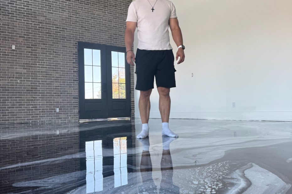
Picking Metallic Tones for a Stone House Lower Level
In a below-grade room with small windows, the tone you pick behaves differently than it does anywhere else in the house. Pewter, graphite, bronze, and warm neutrals sit quietly with schist, slate, and old millwork. Loud blues and greens fight the house. Judge every sample board standing in the actual room at the hour you actually use it. To talk through a direction, call Tru Coat at (445) 444-2879 or request a quote.
Low light changes the color more than anything else
The single biggest factor is how little natural light a below-grade room gets. Two small windows near grade, maybe a well, and after that whatever the recessed cans and lamps put out. Color needs light to behave, and when there is not much of it, everything shifts. Mid-tones go flatter and grayer than the sample suggested. Deep tones lose the movement inside them and read as one solid mass. Anything with real warmth in it holds up best, because warm pigment stays legible under weak light while cool pigment tends to go dull and slightly muddy.
This is why a tone that looked correct in a bright kitchen can land completely wrong one floor down. The light is not just dimmer, it is a different color. Warm bulbs pull an amber pigment forward and push a cool gray back. Daylight through a small window at noon does the opposite for about two hours, then leaves. If you pick under one condition and live under another, you will never quite love the floor, and there is no fixing it after the pour.
The tone families that sit with schist and old millwork
Pewter and graphite are the safest reads when stone is left exposed, because they echo the cool gray already in the wall without matching it exactly. Bronze and antique gold belong where the trim is original and warm; they pick up the same amber the wood has and the room reads intentional. Warm neutrals and greige are the choice when the goal is simply to make the space feel lighter and calmer without any drama at all. Each of those families reads as stone or metal, which is the point.
What consistently fights the house is loud blue and loud green. A bright teal or an electric emerald has no relative anywhere in a stone lower level, so it stops being a floor and becomes a statement the rest of the room did not agree to. Those colors are gorgeous in a showroom or a modern build with white walls. Under a century-old staircase they look like a mistake, and clients tend to see it within a week. More on the tone families is on our Chestnut Hill metallic epoxy page.
Judge the sample where the floor is going
Sample boards belong in your room, not on a shop table under bright shop lights. We bring boards down to the lower level, set them on the actual slab, and look at them at the hour you actually use the space. If the room is a Saturday-afternoon family room, we look Saturday afternoon. If it is a bar you use after dark with the lamps on, we look after dark with the lamps on. Those two viewings can point to different tones on the same board.
Pattern scale, and why small rooms need restraint
Here is where people get surprised. The movement in a metallic pour has a scale to it, and that scale does not shrink to fit your room. A sample board is a small rectangle, so a pattern with big sweeping veins reads as tasteful drama at that size. Put the same pour across a lower level and those veins are now several feet long, and in a room that is already tight with small windows they can take the whole space over.
The move in a smaller below-grade room is to pull the movement in. Tighter cells, less contrast between the base and the metallic layer, and a narrower range of tone overall. The floor still has real depth when you stand over it, but from the doorway it reads as one calm surface instead of a mural. In a larger open lower level you have room to let the pattern breathe. Getting that read right is a judgment call made standing in the room, which is why we make it there.
Sheen is a decision, not a detail
The topcoat sheen changes both how bright the room feels and how much maintenance you notice. A gloss finish throws light back into the space, and in a dark lower level that is a genuine advantage; the room stops feeling like a basement. The trade is that gloss shows dust, footprints, and pet tracks between cleanings, and on a floor with a lot of contrast in it, those marks catch the eye.
Satin gives up some of that brightness and takes back most of the upkeep. Dust reads as less obvious, footprints mostly disappear, and next to old darkened woodwork a softer sheen usually looks more at home than a mirror. For a home theater or a bar, satin is often the better answer for that reason alone. Neither is more durable than the other; the wear layer is the same. It is purely a question of how bright you want the room and how much you want to look at every mark on it.
The honest limit
Every pour is worked by hand while the resin is still moving, so no two floors come out the same. We can match a direction, a palette, and a mood from a board you approve, and we hold to it closely. We cannot duplicate a floor from a photo you found, and nobody honest will tell you otherwise. That uniqueness is the reason to choose a hand-poured floor in the first place, but you should walk in knowing it, not discover it on install day. See finished pours in our gallery.
Tone Selection FAQ
Should I pick a lighter tone to brighten a dark lower level?
Lighter helps, but sheen helps more. A mid-tone pewter under a gloss topcoat will throw more light around the room than a pale floor under satin. Pick the tone that suits the house, then use the topcoat to dial the brightness where you want it.
Can I choose from photos instead of sample boards?
Photos are useful for narrowing a direction and useless for the final call. Screens shift color, and no photo carries how a pour behaves under your specific lighting. We always put physical boards on your slab before anyone commits.
Why do you look at samples at a specific time of day?
Because a below-grade room has two different lighting conditions and they are not close. Weak daylight through small windows in the afternoon, and lamps or cans at night. A tone can look right in one and wrong in the other, so we look at whichever one matches how you use the room.
Will a bold color really look bad down there?
It will look loud. Bright blues and greens have nothing to relate to next to schist, slate, and dark trim, so the floor pulls attention away from everything else in the room. If you want something with more personality, we would rather push a deep bronze or a charcoal with strong movement in it than a color that argues with the house.
Can you make a pour less busy than the sample?
Yes, and in a small room we often recommend it. Tightening the cells and narrowing the contrast between the base and the metallic layer keeps the depth while calming the pattern down. We show that difference on boards so you can see both before choosing.
Look at Tones in Your Own Lower Level
We bring sample boards to the room, at the hour you use it, and pick a direction with you before anything gets poured. Serving Chestnut Hill and the Philadelphia area from Broomall, PA.
Reserve a Walkthrough (445) 444-2879